Project: MYOB product selector
THE PROBLEM
Usability testing revealed some MYOB users enjoyed looking at a comparison-like application online, others preferred a more guided experience and wanted a distinct recommendation.
The optimization team in the online crew came up with an idea: a walkthrough-like app that would explain each feature, and give a specific recommendation to a business.
From a copy perspective, I faced three key challenges:
#1. How can we ask essential questions without annoying the user?
#2. How can we explain complex features in a way that users can understand quickly?
#3. How can we make the experience - if not fun - then at least positive?
If we could solve these challenges, then we could hit our goal of increasing conversion and reducing churn.


Just one example of an edge case…
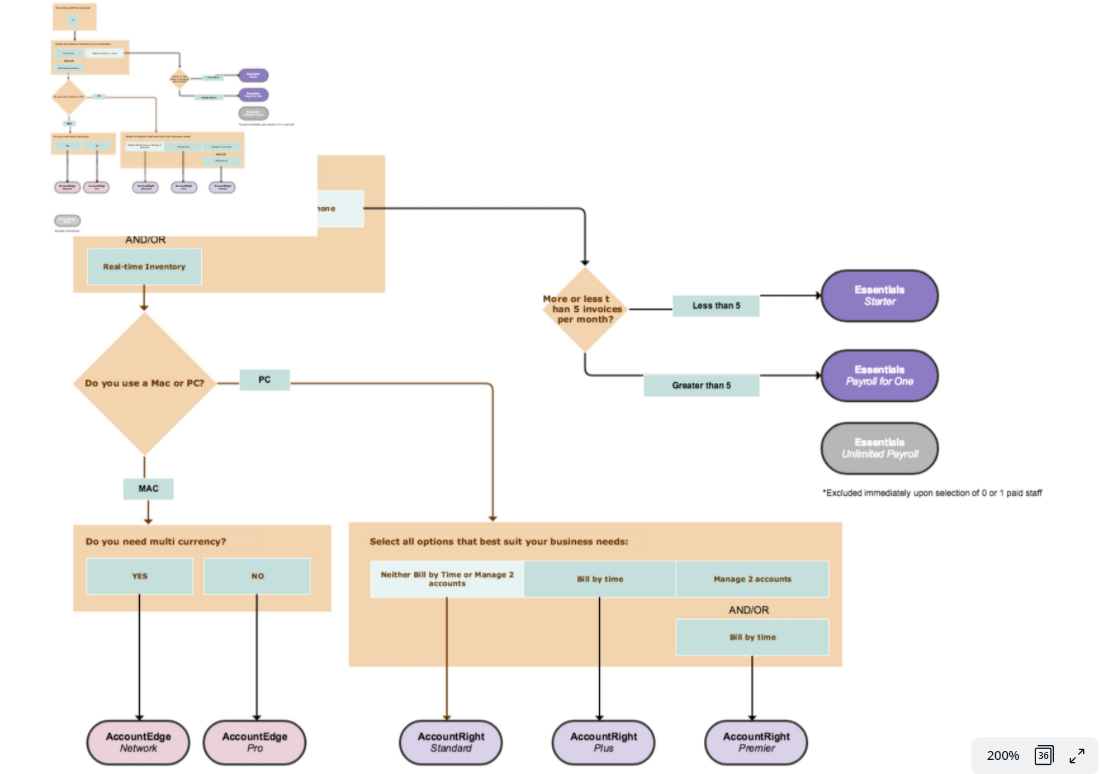
Worked with stakeholders to come uip with a question flow…
THE PROCESS
The first job was to work with the team, brand, marketing, and the sales teams, in order to understand what questions we should ask.
Ideally we would ask only the number of questions the customer needs to get a recommendation. However, the business also wanted to gather data.
We also needed to understand how many different product pathways there were, and if any of them required specific messaging.
For instance, we had three products, each with three tiers. Many recommendations could change based on whether users required a PC, or a Mac, and so on.
With the logic nailed down, I began to work on the messaging.

the process
While this project was not a chatbot, I took note from what users had mentioned during unrelated usability tests about wanting a "guide" or needing their "hand held".
As a result, I opted for a more inclusive and informal tone (see pictures to the right).
I also added some flavour text underneath each question to both provide some additional instruction, and lighten the mental load.
While my initial idea was to merely place the instruction in the main headline, at the time the business (and brand team) were intent on creating more "delightful" experiences and opted for this approach.
If I could complete the project again, I would have pushed harder for the simpler option.
Crucially, testing revealed this copy didn't stop users from completing tasks.


THE process
I had no intention of experimenting with anything outside our brand. However, I did want to extend the possibilities of design.
Our tone of voice featured three prongs:
Sharp as a tack
Charismatic
Energetic
Given we wanted people to complete the selector as quickly as possible, I opted for a slightly more "energetic" tone than our usual "sharp as a tack" option.
This also addressed the business need to create a more "delightful" experience.

This solution isn't a chatbot, but we did want to give users the feeling they were being guided. Users responded well to the warmer tone in testing.
PROCESS (HOVER STATES)
I had to create descriptions for each feature during the hover state that would accurately describe what that feature did.
Usability testing revealed some challenges. For instance (as mentioned previously) users didn't understand what job tracking meant for them personally.
During prototype testing, users revealed these features were either not focusing on their needs enough, or revealed unforeseen needs.
For instance, the original tax and GST (Goods and Services Tax) hover state never mentioned a BAS report (Business Activity Statement). Users pointed out that was one of their key needs. I changed the text to reflect that priority.
It's important to note here that all of our users understood what a BAS report was - it's part of why they wanted accounting software in the first place.


SYNTHESIS (TESTING)
We decided to run the product selector as an A/B test, funnelling users through the main acquisition pages with a CTA.
Hypothesis:
Introducing alternative methods to compare accounting software will enable prospects to orientate to an appropriate product with greater ease and efficiency, driving visit to trial/direct-buy conversion %.
Success Metrics:
Click-through to trial/buy
Visit to trial conversion %
Visit to direct buy conversion %
RESULTS
The new product selector resulted in a 12% visit to trial conversion uplift.

Some choice words from the CEO…